The Japan Times
Japan’s oldest English-language newspaper
Redesign and rebranding
The Japan Times
Japan’s oldest English-language newspaper
Redesign and rebranding
The redesign and rebranding of Japan’s oldest English-language newspaper
A redesign was long-overdue
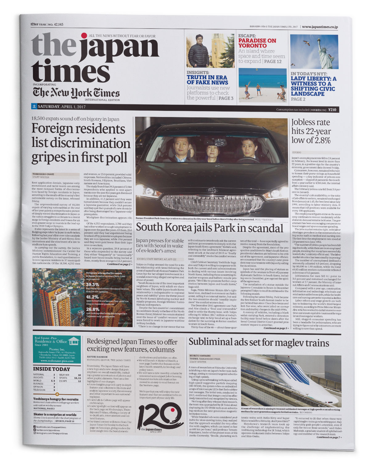
In 2017, The Japan Times celebrated its 120th anniversary and it was decided that the newspaper and company brand should be updated.
Prior to this, the last time The Japan Times had had a major redesign was 30 years before, for its 90th anniversary in 1987, when the previous logo first graced the front page.
Before that, the paper had last changed in 1956 and before that in 1943, when it was renamed Nippon Times due to nationalist pressure. In all, since the newspaper’s launch in 1897, the paper had been through eight major logo changes and several name changes. Yet, it remained true to its original mission to provide a bridge between Japan and the world.
As we counted down to the 2020 Summer Olympics in Tokyo, the company wanted to once again update The Japan Times with a new look.
How I made it happen
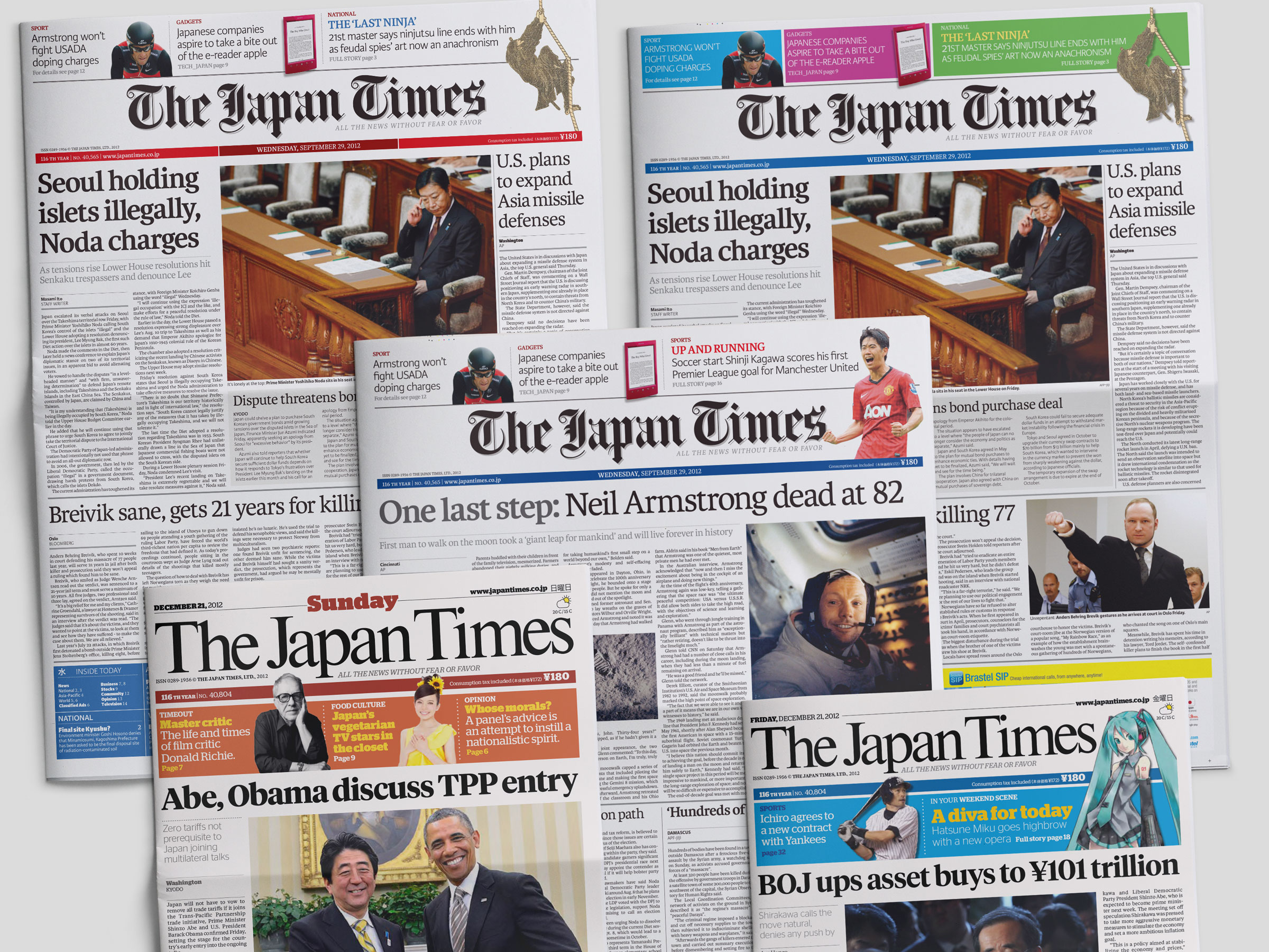
On a personal note, I was initially hired by The Japan Times as an editor and had been working in the features department as such for several years. With my experience in editorial design, however, I was constantly pushing the company to update the look of the newspaper. In 2012, I even made several mockups suggesting how we could refresh the 1987 design to bring it up to date (which you can see below). Eventually my persistence paid off when, in 2013, my mockup of the JT as a tabloid essentially became the JT OnSunday (which you can see here.)
Then, when the 120th anniversary approached, I finally convinced the company to let me redo the daily paper. There was, however, a major constraint: There was no budget for a design team, so I would have to do it alone. It was a massive task, but well worth the effort.
You can read my article on the redesign here:
The Changing Times: JT’s new look
And on the logo here:
The Changing Times: Our new face
Initial mockups (2012)
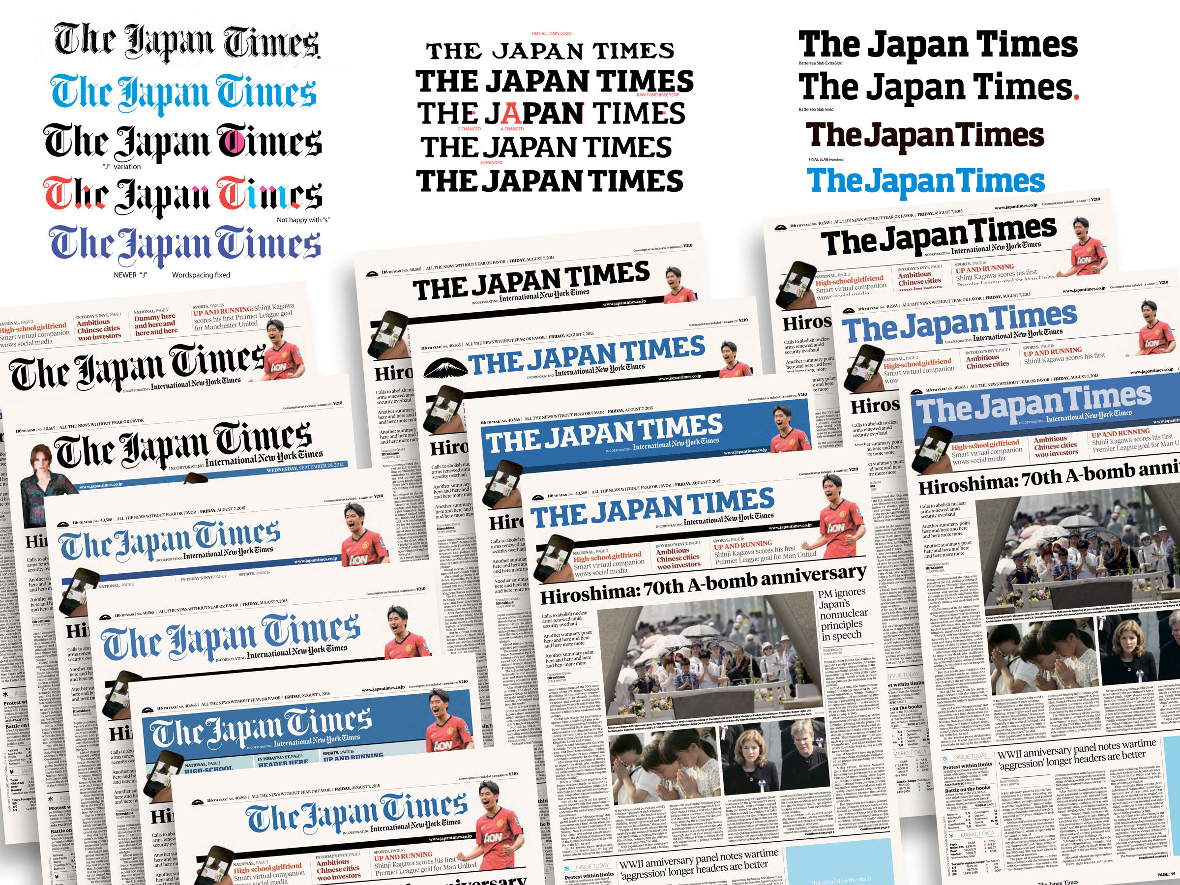
Early experiments using a reworking of the original blackletter logo from 1897 and tabloid-sized mockups of the daily paper.
Logo and masthead mockups (late 2016)
Initially, we considered reintroducing the inaugural blackletter logo from 1897, in order to emphasise the JT‘s Meiji-Era roots, or the slab-serif logo from 1933. After redrawing and digitising these logos, and testing them in both print and screen we realised, however, that they simply weren’t working. While they captured the paper’s past, they didn’t convey where the company wanted to be in the future, so we began looking for a more modern approach.
Going lowercase
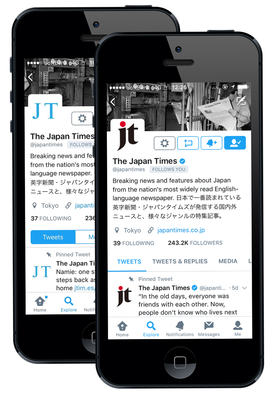
We realised early on that, true to responsive web design methods, we needed to work backward from the smallest version of the logo we would need. In today’s digital world that often means the icons used on social media — in this case simply the abbreviation “JT.”
Unfortunately, sometimes individual letters simply look terrible out of context, and the blackletter “J” and “T” were almost unrecognisable alone.
In fact, as we abandoned the blackletter idea and looked at other options, including a contemporary take on the 1933 all-caps logo, we realised that the capital letters “J” and “T” are, in general, pretty horrible together.
When shrunk down to the small sizes needed for reading on mobile devices, “JT” had a tendency to look like the symbol for pi (Π). The awkward white space above the descending hook of the “J” also made things difficult. Another problem was the association in Japan with the “JT” logo of Japan Tobacco.
The lower case “j” and “t,” however, looked like a much more promising option.
But, how would the full title “The Japan Times” look in lowercase, and would it be able to capture both the classic feel of the blackletter that we sought and the contemporary mood of optimism that we wanted to convey in the buildup to the 2020 Olympics?
After some serious searching, a typeface was found that had the right feel.
Final logo (2017)
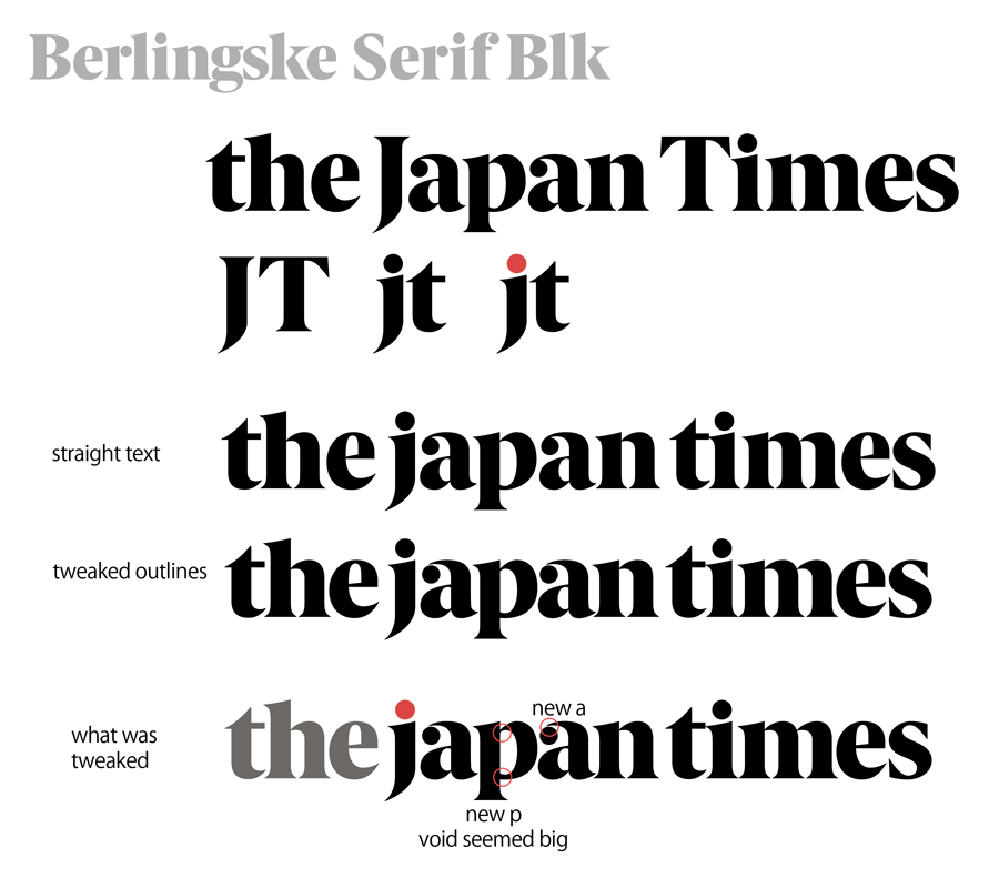
After a long search I was able to find a font that had previously been created for another news publication and that matched our needs. It turns out it also had the elements we wanted for our new logo and masthead.
The Berlingske family of fonts, by the Danish font foundry Playtype, was initially created as a custom font for the Berlingske newspaper in Denmark. Playtype designed Berlingske “to deliver significant modernization while paying homage to a unique heritage,” which clearly matched our search for a typeface to use in the redesign for our 120th anniversary.
The serif styles of the Berlingske family have a particularly nice calligraphic feel to them, which we felt evoked the brush strokes of Japanese script — this is especially true for the Serif Black style.
In the “jt” icon notice how the arc of the stem in the descender of the lowercase “j” comes to a point, as if an inked brush was lifting from the page. This classic feel to the letters also manages to prevent the lowercase “the japan times” from becoming too light-hearted.
I made some small tweaks to make the final logo slightly more unique to The Japan Times, including separating the ball on the terminal of the “a” from the stroke in a slight nod to elegant spirals and curves on the “T” and “J”, and the ball on the “a” of the original blackletter logo.
The logo also has a two-line version used only for the front page, plus the abbreviated “jt” icon for online and elsewhere.

Front page logo placement
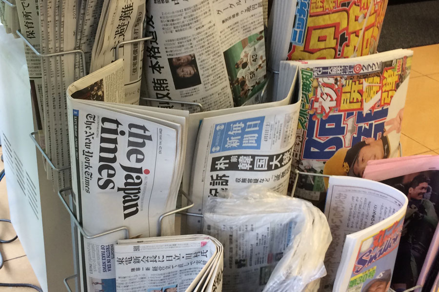
Like many newspapers, the front page of The Japan Times traditionally featured the banner logo centred at the top of the page. The problem with this, in Japan however, is that when newspapers are displayed at newsstands here they are folded vertically and placed in racks, rather than stacked in flat piles, as they are in other countries. This meant that prior to this redesign, the JT was often incredibly hard to find, as its logo all but vanished behind the vertical fold.
By creating the two-line version of the logo and placing it in the top-left corner of the front page, the paper now stands out in Japan’s crowded newsstands.
Page design
The design constraints given to me were set in stone: no change in format, the paper would stay broadsheet. It would also stay at its current volume of pages; no increase in colour pages, except for rare occasions only the front and back pages would be colour; and, finally, the grid had to accommodate existing ad sizes.
Editorial changes, too, were integral to the redesign process. As readers generally get their breaking news online these days, the new print edition would increase longer reads, more features and day-two follow up articles.
Changing the focus of several pages to accommodate these longer reads and keeping smaller articles and briefs on the news pages, we were able to be more creative with the design when necessary, but not change things too drastically as to be distracting.
Editorial changes include shifting art, culture and travel features to the back page to take full advantage of our colour pages, as well as having more features focusing on national news issues on the relabelled Page 3, “Insights.”
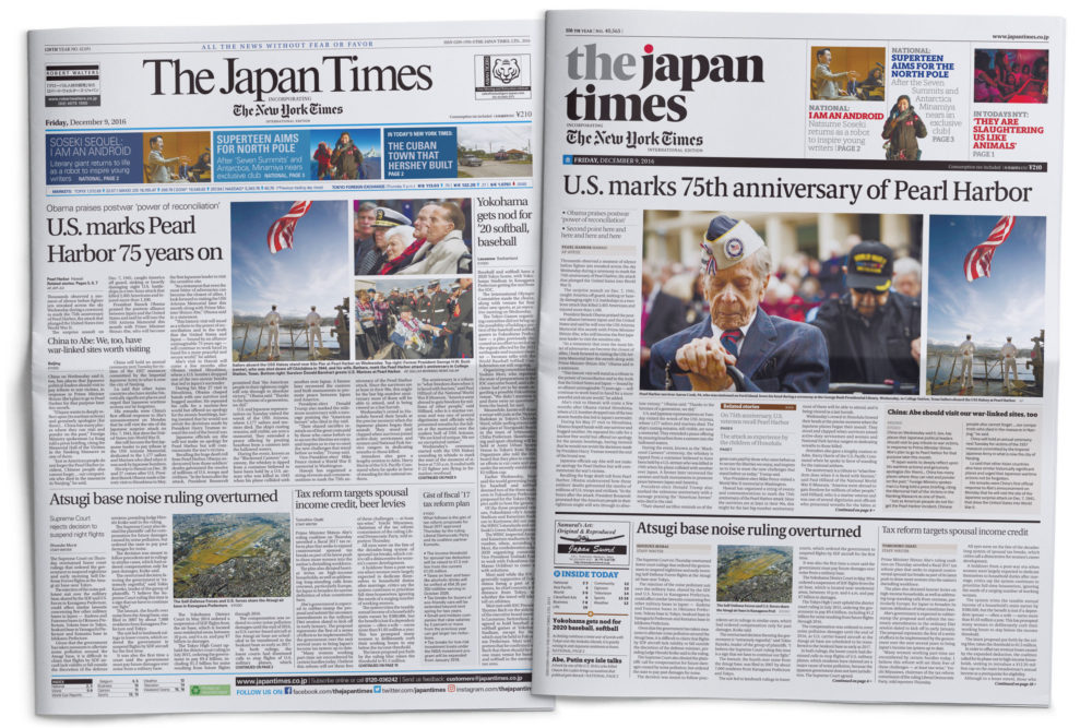
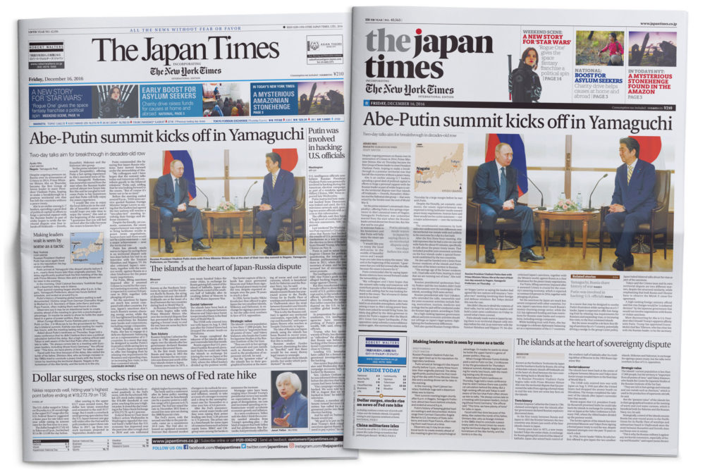
For a more comfortable reading experience the narrow eight-column measure was replaced with a flexible six-column grid. I also encouraged editors to “go large” with images.
The text font has also changed from Utopia to the beautiful Berlingske Serif Text Light and several other weights of Berlingske Serif Text were used for headlines and elsewhere throughout the paper.
As we got closer to the launch of the new look, I frequently re-did the current day’s page one in the new format to help page editors and production staff get used to how it would effect story lengths, image choices and so on. There are some examples below.
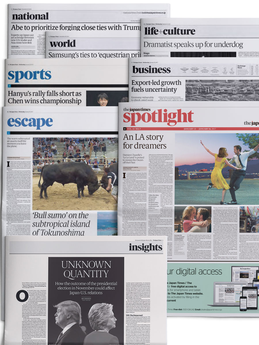
Launch day: April 1st, 2017
It was a long journey to reach launch day. Redesigning a national newspaper was always going to be risky, especially one as established as The Japan Times, there will always be someone who doesn’t like what you do. My favourite anecdote about David Hilman’s radical 1988 redesign of The Guardian newspaper was when one reader wrote “‘Got the comic. Where’s the newspaper?” Now, of course, Hilman’s design is seen as a seminal work of modern newspaper design.
Considering the April 1st launch date of the JT’s new look, it was possible that one or two of our readers may also have thought we were joking. Especially as it has long-been tradition for the paper to run an April Fool’s Day gag article on the front page!
Thankfully, however, the reaction we got from our readers was incredibly positive and made the whole process worthwhile.
